Origin of Viventem
Founded by Novem Vivit in 2021, Viventem is a record label that specializes in Medolic & Techno house music.
The word, Viventem means living in Latin, which is a play on the artist’s name, Novem Vivit, nine lives in Latin.
The Ask
For this project, Novem Vivit requested creative concepts for different categories with the intent to grow his brand.
After having an initial conversation to understand Novem’s needs, we jogged down the 3 types of artwork he needs to continue to scale his brand as a DJ.
Project Role
Creative Director, Designer
Timeline
3 Weeks
Artwork Types:
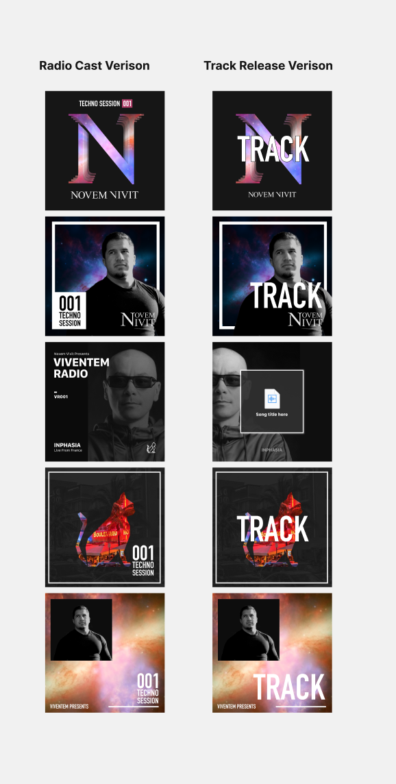
Radio Cast
Music Podcast to showcase track collaboration with other artists.Deep Techno
1st music genre that he producesMelodic Techno
2nd music genre he produces
Approach
We approached this through a collaborative process by meeting over the span of 3 weeks using Figma & Facetime to connect every step of the project.
This worked exceptionally well since it empowered Novem to collaborate, giving us the room to diverge & converge on inspirations, and also sync to regroup in the same space to discuss the next steps.
Concept directions
Design Process:
1.“Mood Board“ + Analogous Product Board:
Novem & I collected brands out in the world to narrow down skyless possibilities. Through this exercise, we were able to establish his brand principles to ensure that it was going to be scalable.
2. Concept directions:
With the visual mood board & Viventem’s brand language: Simple, Bold & Direct, I explored the visual concept by taking a one size fits all approach so that it’s scalable for Novem in the future.
I used the following visual elements to communicate Simple, Bold, & Direct.
• Thick strokes
• Legible Bold & Condensed Typography
• Images to either highlight artist or the artist’s origin
• Colors / Gradients to communicate Track tone
Challenge: Prioritization & Delegate
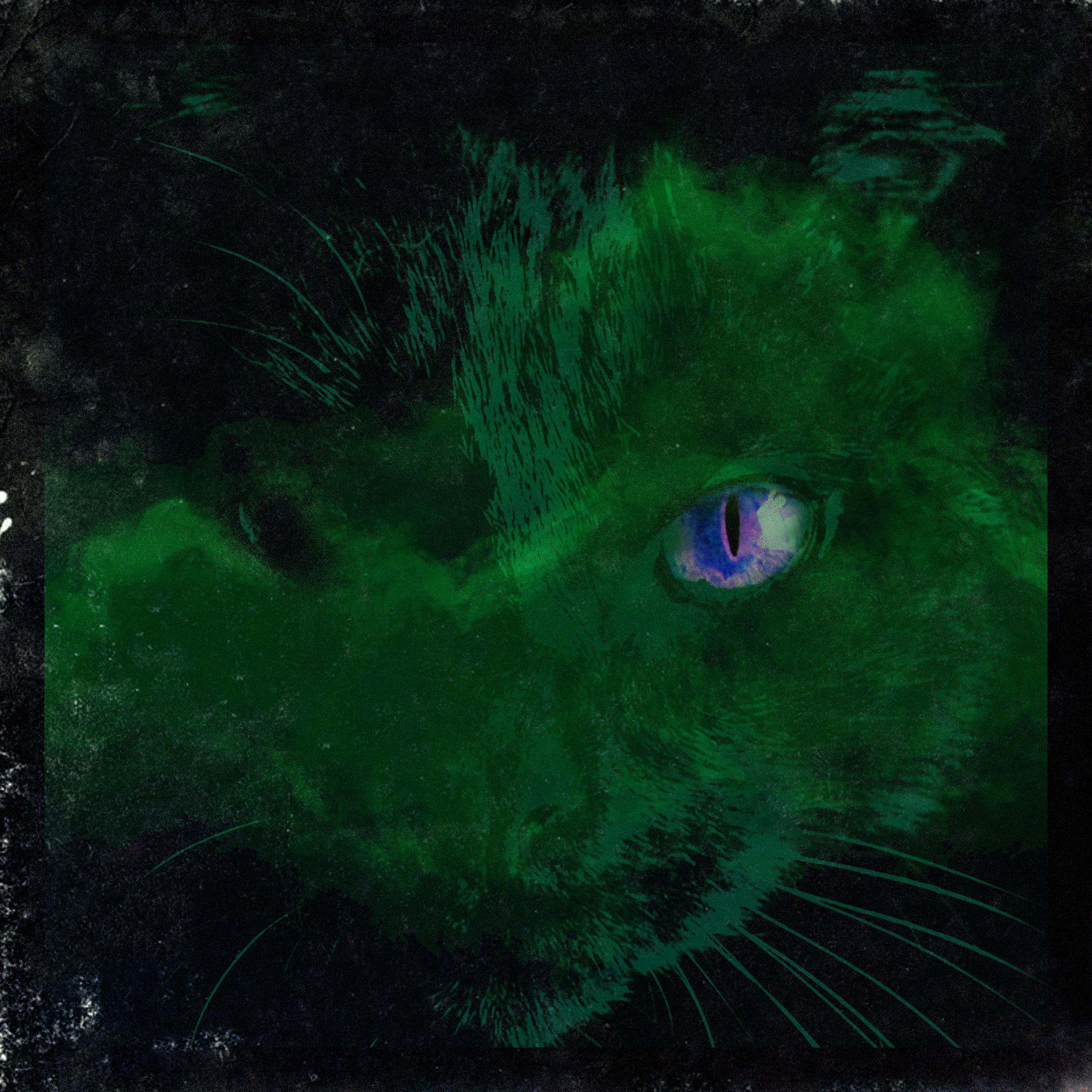
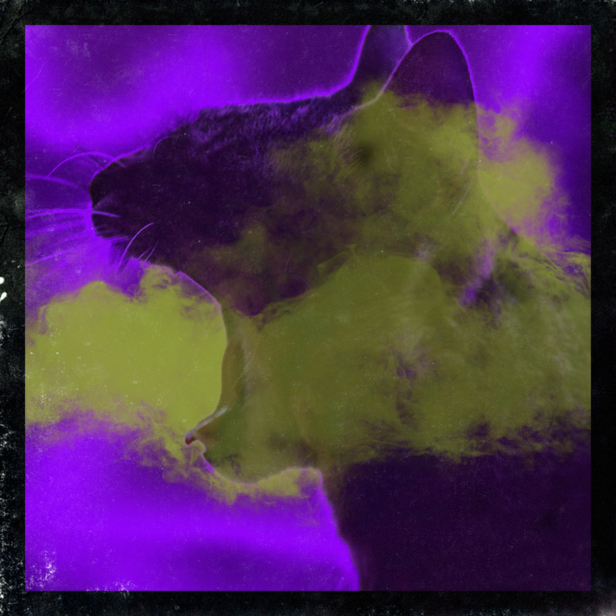
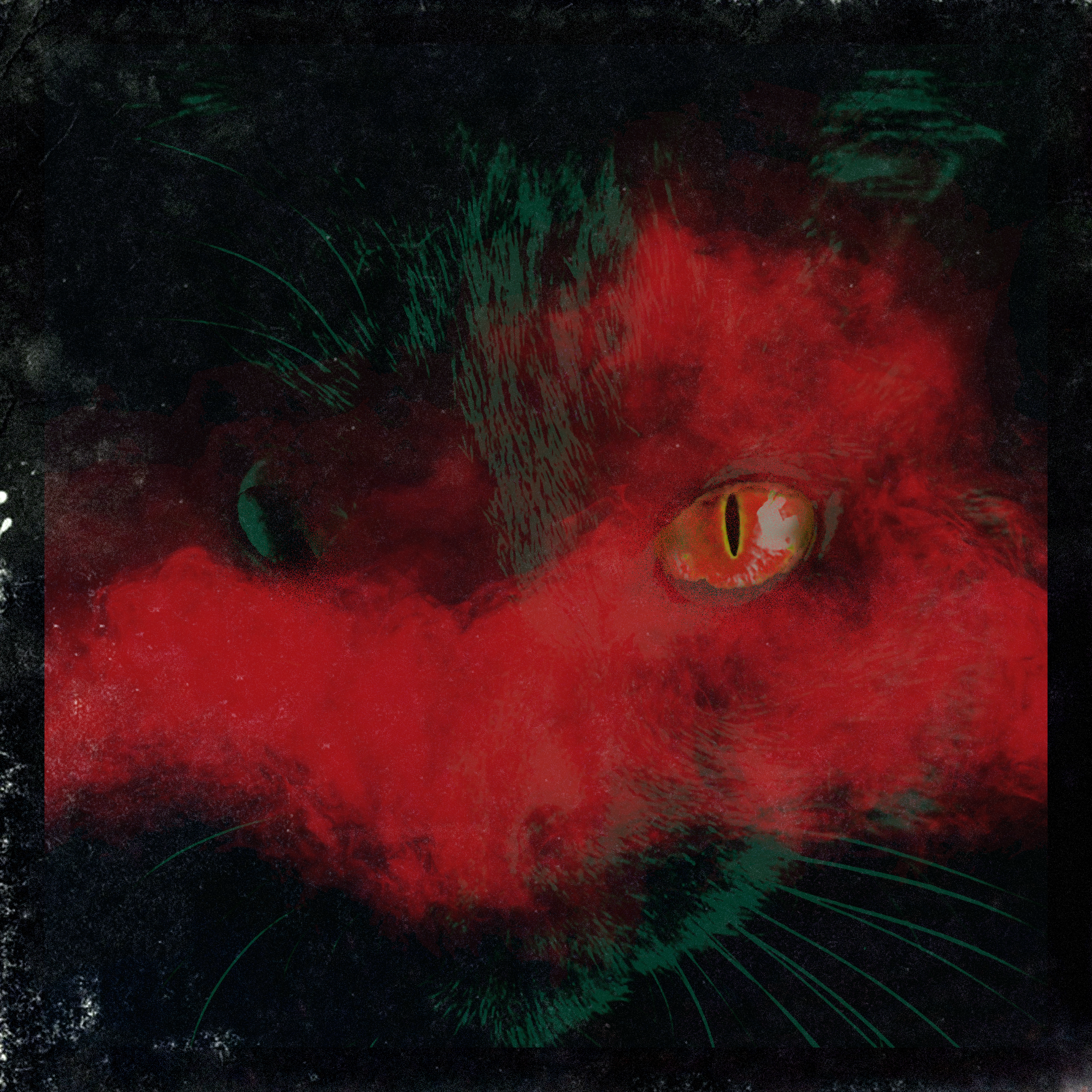
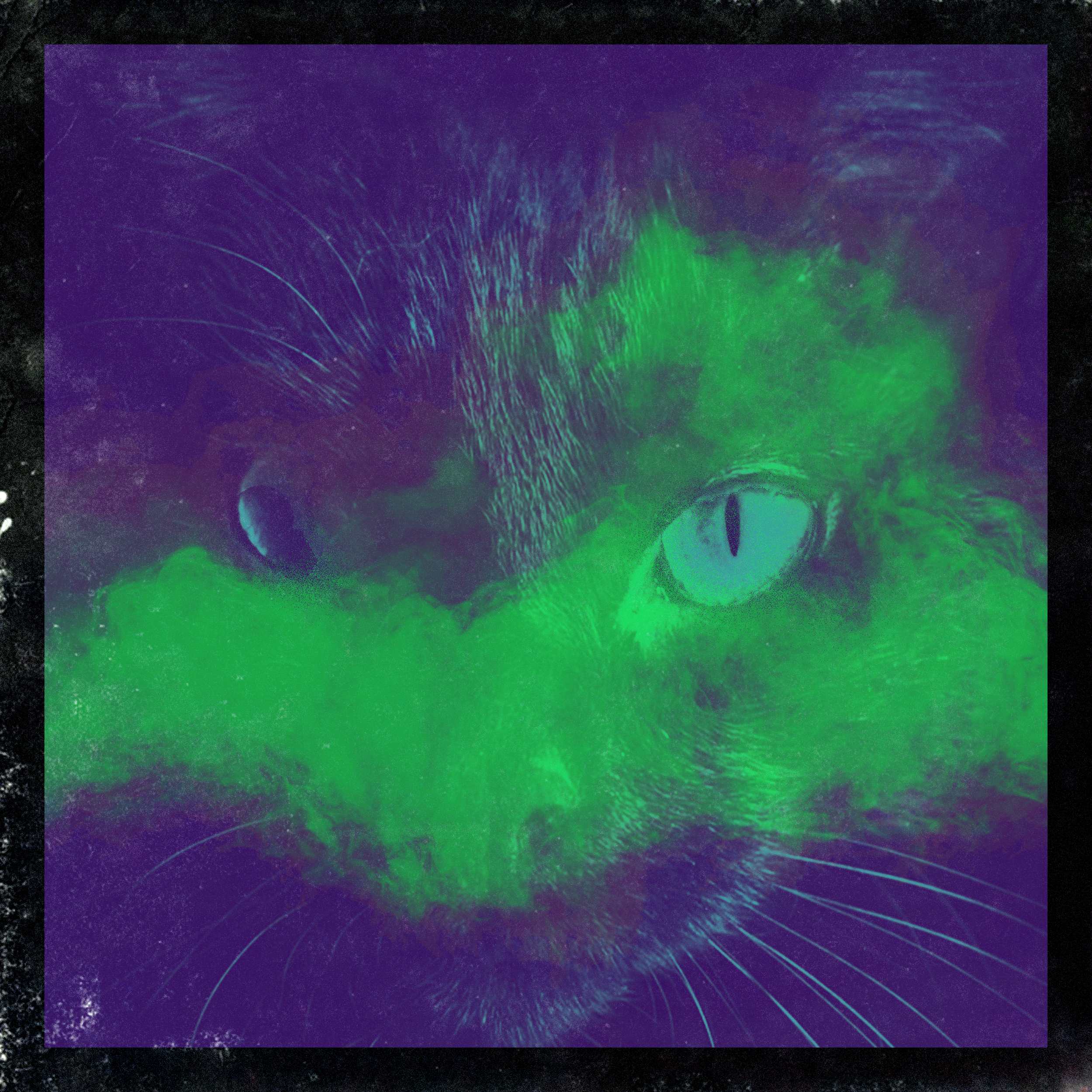
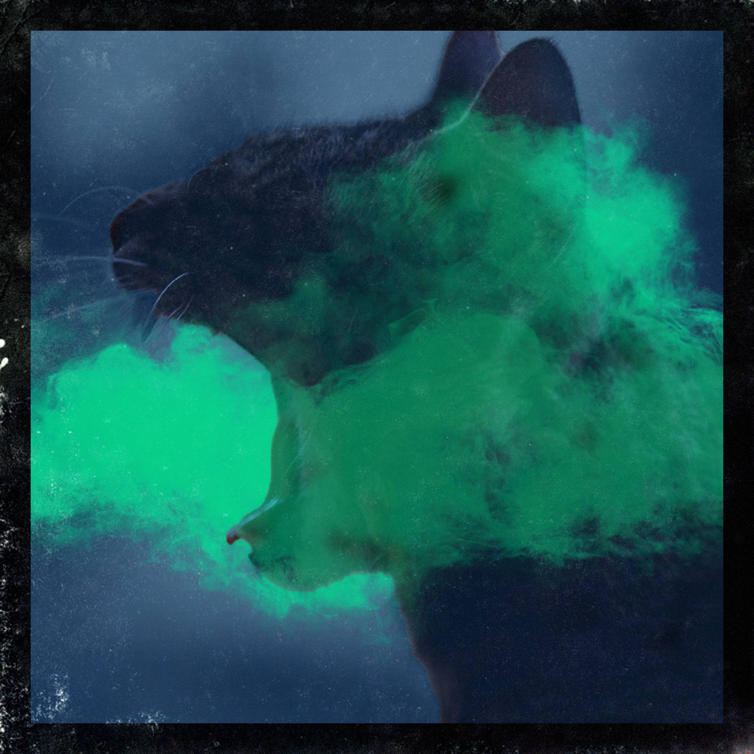
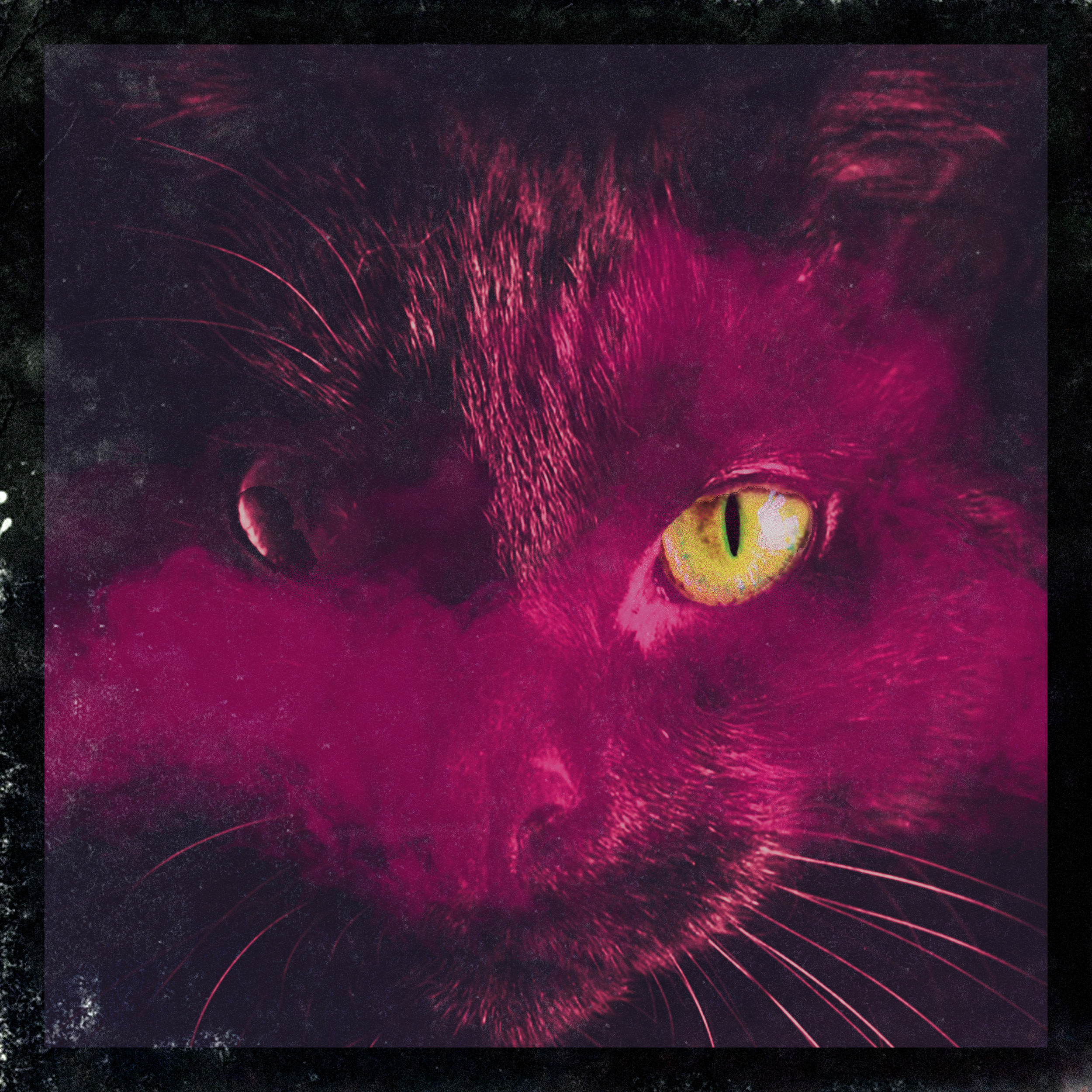
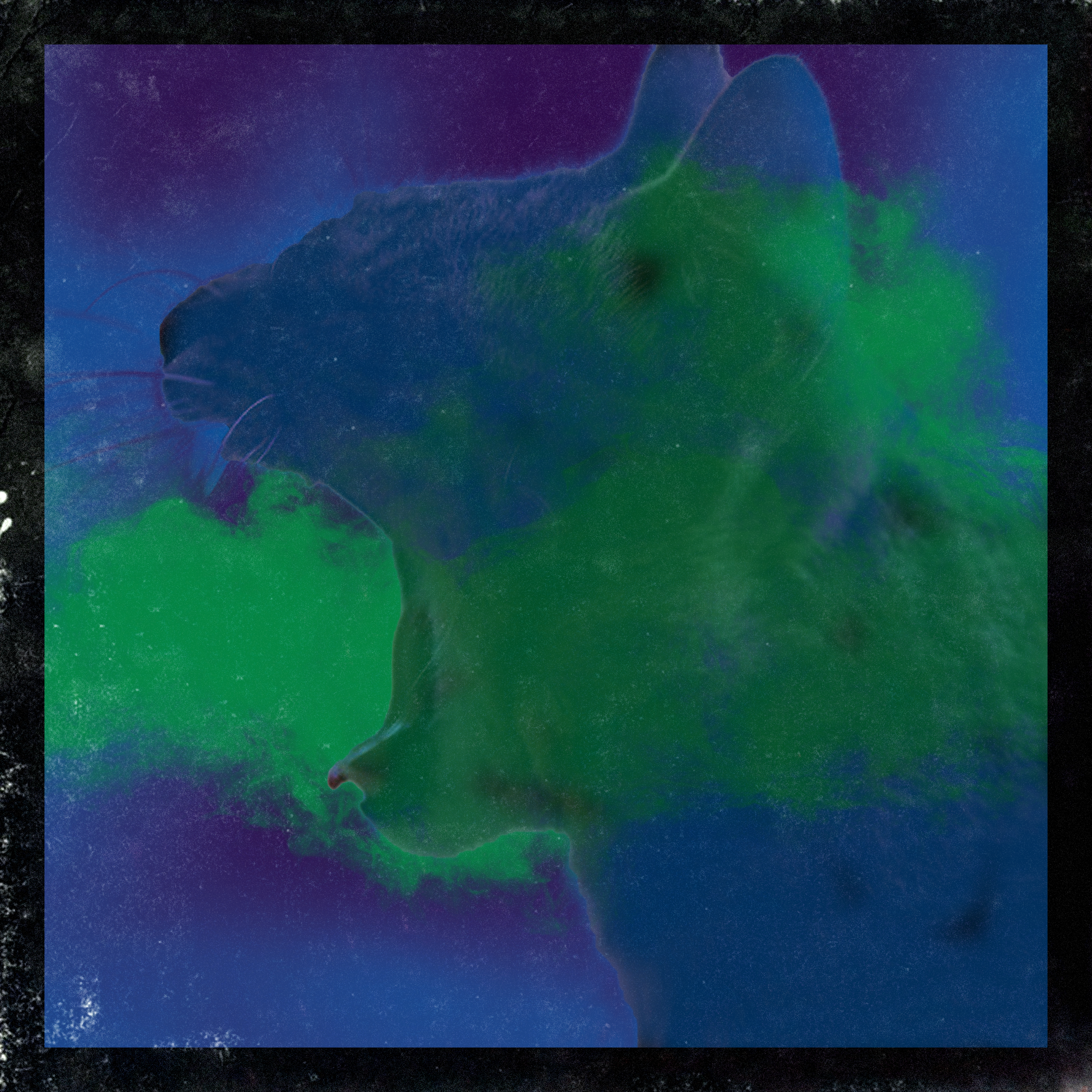
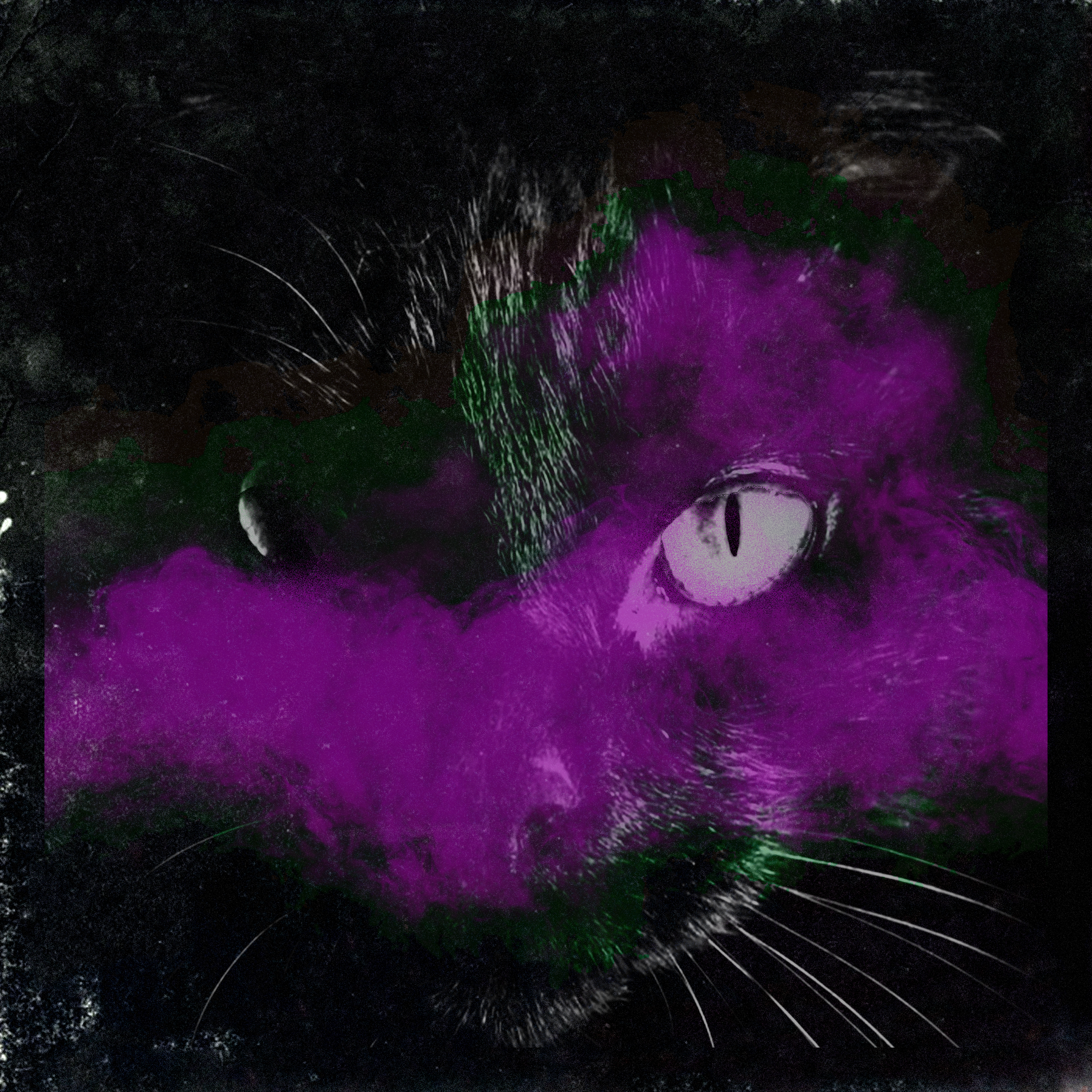
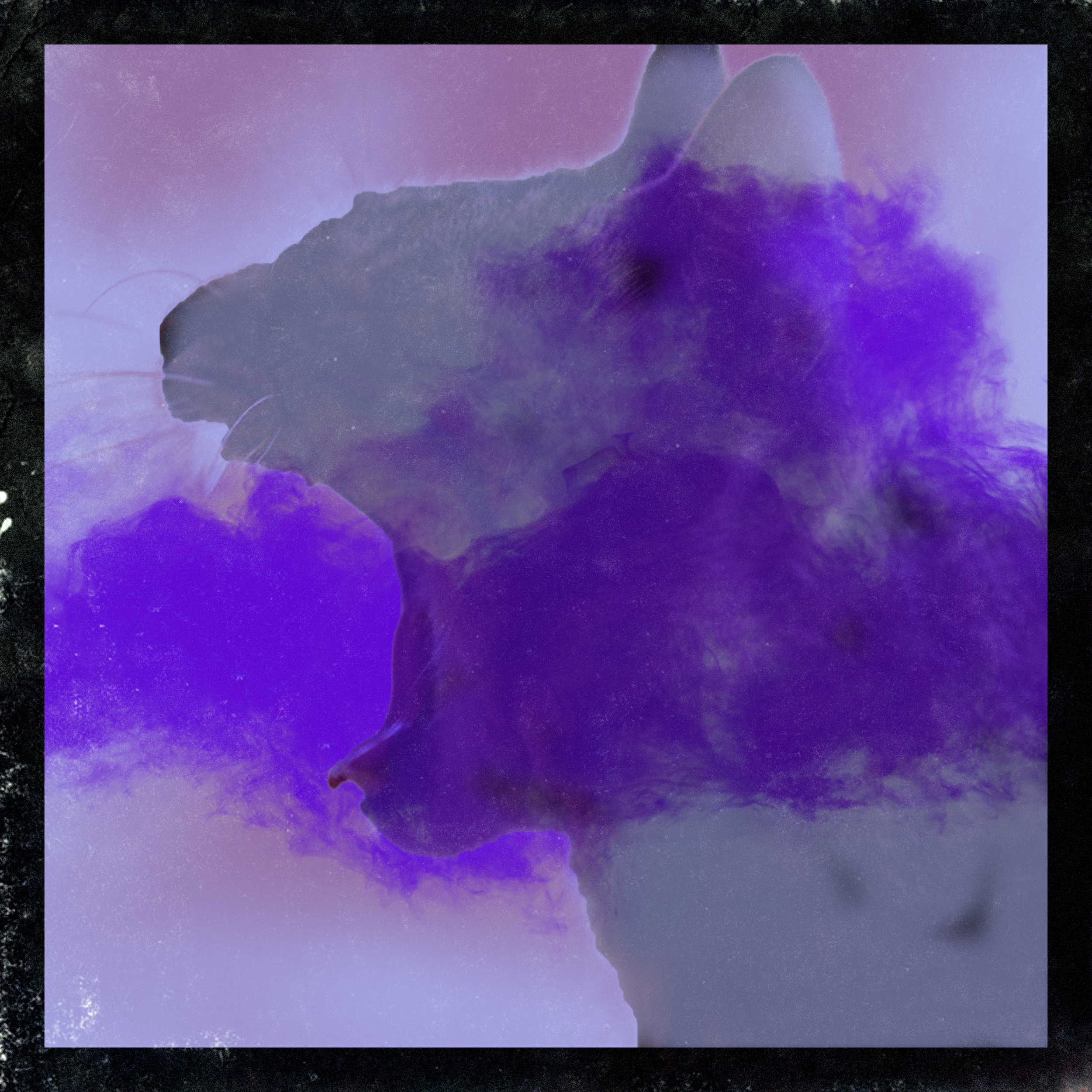
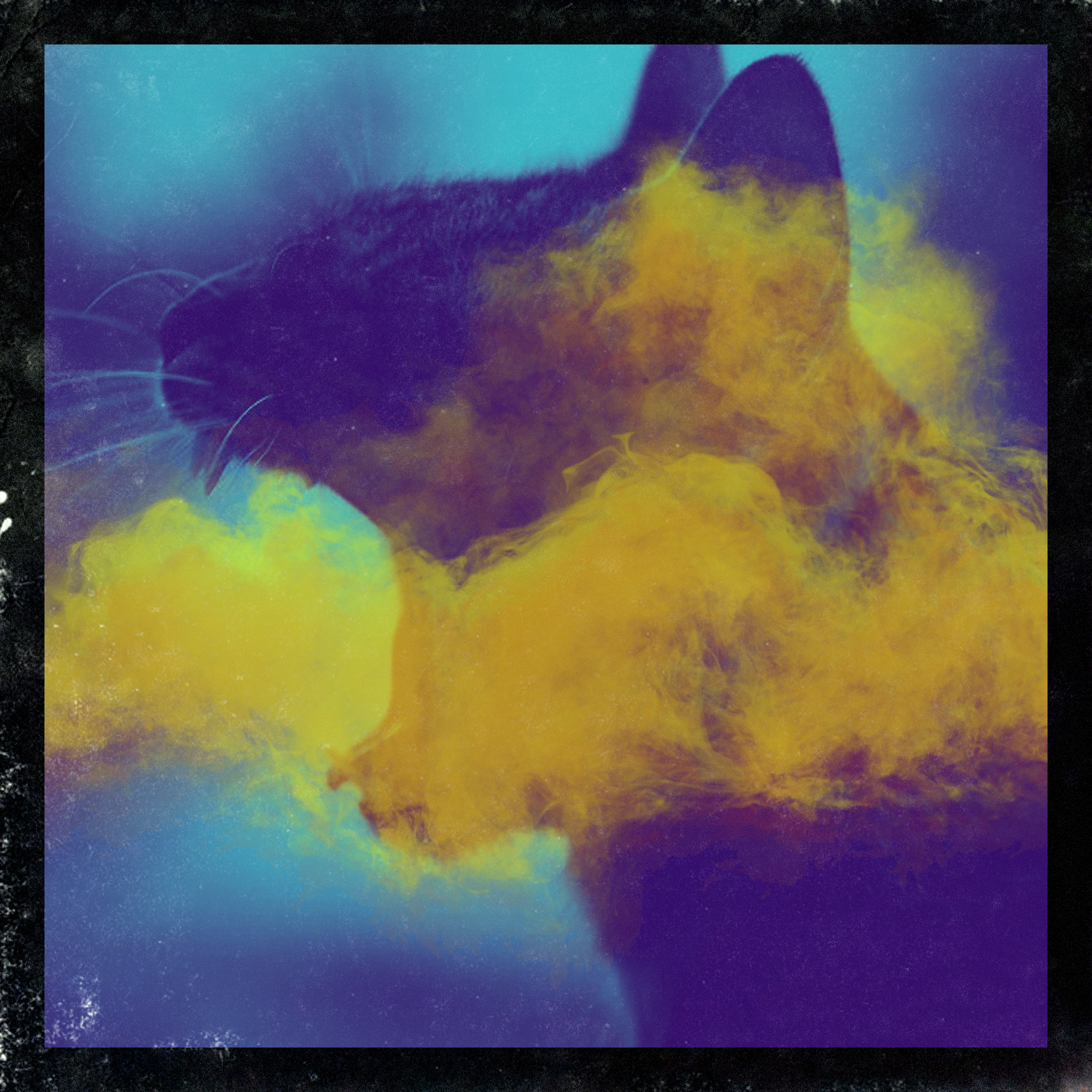
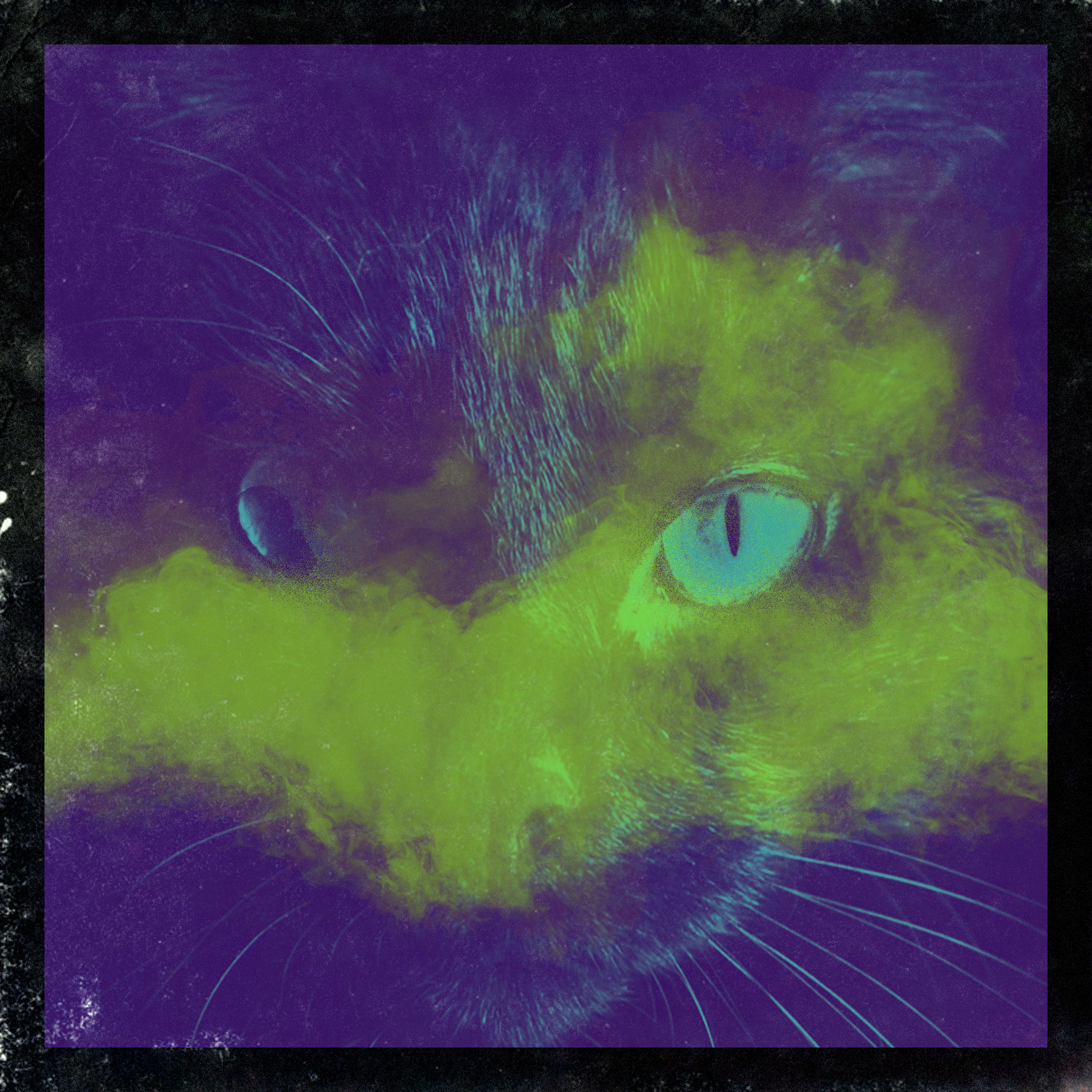
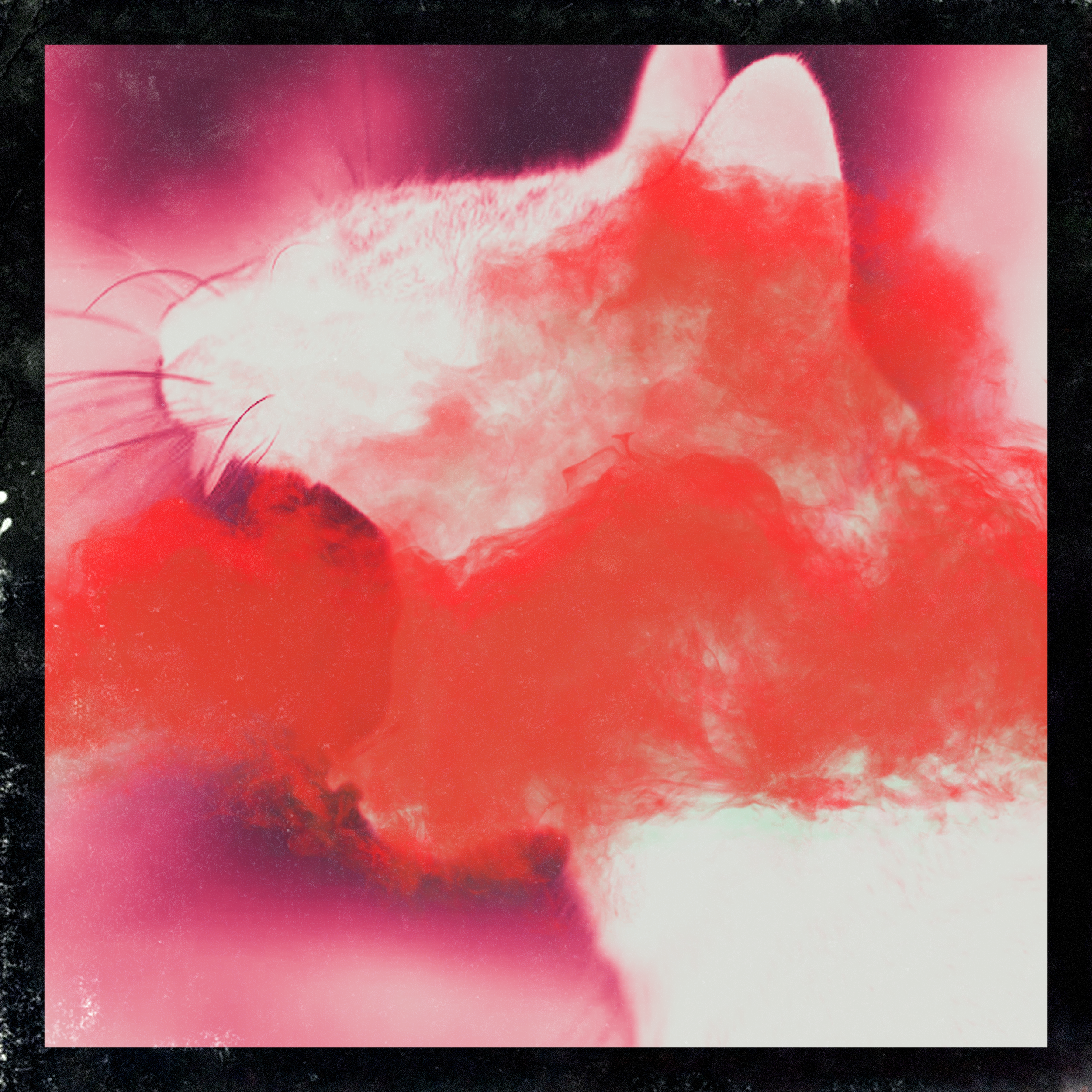
Through reviews, Novem gravitated toward having an imagery forefront for the Radio cast and bold typography across directions. As I continued to refine directions to meet the project timeline; Novem had a change of heart and wanted to explore more a photo-manipulative direction for track release. Seeing this as a conflict of project scope and delivery timeline, we decided to get another designer involved with the alternative direction so the project will stay on track.
After having the other creative on board, I acted as a consultant with the 3rd party’s work to ensure the brand language is consistent while I mainly focused on bringing Radio Cast design details to life.
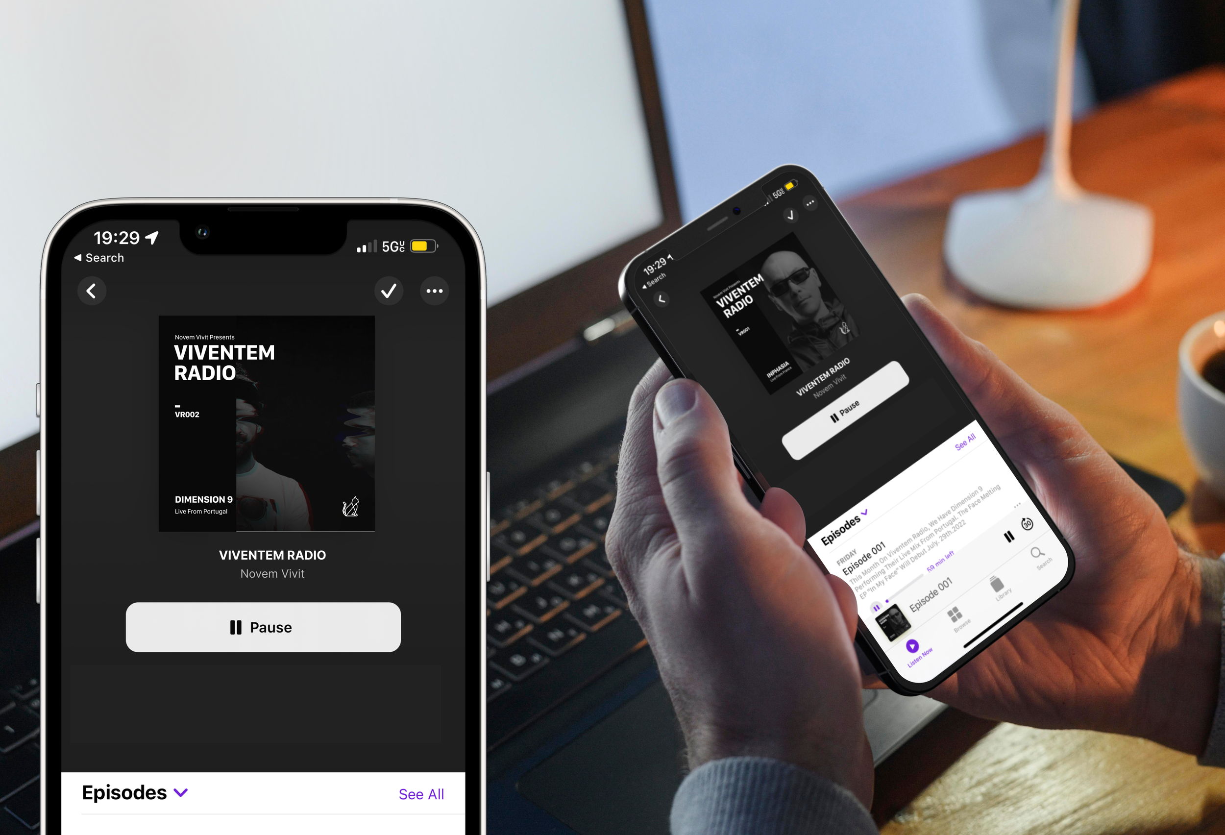
Final Designs in application
